25 Dec 2023 | 4 mins read
7 Best Practices in Responsive Web Design
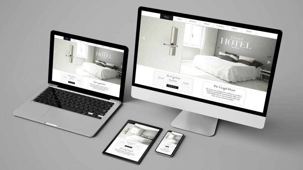
What Is Responsive Website Design?
Responsive design is to design the web page to fit in different screen sizes on a variety of devices. Web content should be accessible regardless of the device screen size the user is using to view it. Neglecting website design for smaller screen sizes has a direct impact on user experience especially when more than 50% of potential website visitors are mobile device users.
Imagine using your phone to browse your favorite website to find out that the font size is too large, the elements are misplaced, or overflow the screen or buttons are too small. The solution to these common problems is responsive website design.
In brief, a responsive design means that your web page should look good, be easy to use, and fit on any device at any resolution.
Responsive design: 7 best practices
There are a few significant aspects to take into consideration when designing a responsive website. Here are our 7 responsive design best practices that will help you make sure your websites offer the best experiences across all devices in 2021!
1. Responsive vs fluid layouts
Responsive layout and fluid layout are closely related but are not the same. The responsive layout uses breakpoints of fixed units of pixels at which the page layout changes to deliver the best user experience based on the target device. Fluid layout, on the other hand, uses percentages relative to the screen you are viewing it with to automatically resize the elements in the web page.
A fluid layout might sound great; however, some elements might look strange relative to the size of the screen. For example, If the screen is too large, some elements may look stretched. if the screen is too small, the content may become too small or difficult to read.
For a design that looks good on different screens and delivers the best user experience, we recommend you make the layout of the website responsive and use fluid design for certain elements.
2. Use at least three breakpoints
Use CSS media queries to set breakpoints that adjust the appearance of the content on different screen resolutions. For a responsive website to work properly with different screen sizes of various devices, it is recommended to use at least three breakpoints. The breakpoints are usually used for mobile devices, tablets, and desktop views. However, More breakpoints can be added for a wider range of screen sizes.
3. Pay attention to typography
Typography is the foundation of the design. People visit websites for content. If people can’t read any of the website content, they probably won’t stay. the content should be easy to read and truly optimized for the screen size. That’s why when it comes to responsive web design, it’s vital to choose a typeface that works well on all screens and device resolutions. In addition, Use em or rem instead of px for scalable font size. Em or rem are based on percentage while px has a fixed dimension standard.
4. Prioritize content
The responsive design revolves around content. One way is to shrink the layout proportionally to the screen size so elements will fit well on mobile. Another is to hide some content on smaller screens. Be aware that content should be highly-focused for the best mobile experience. That’s why it’s recommended to prioritize content that delivers maximum value for your users. One great solution is to only show important content on the small screens and hide the remaining content behind some form of “more” link. as the screen size increases, more content can be added.
5. Buttons on desktop vs touchscreen.
On a desktop, we use a mouse, hence interactive elements might be easy to click on. On the other hand, we interact with our fingers on touch screens. finger tap size varies from one user to another. If interactive elements are too small or too close, the users might end up feeling frustrated. That’s why it is recommended for the size of buttons, links, and other clickable areas to not be less than 45×45 pixels with sufficient whitespace around for an optimized design for touchscreens.
6. SVGs for icons and illustrations
SVGs or Scalable Vector Graphics are best to utilize for illustrations or icons in any responsive design. SVGs are endlessly scalable unlike image files (PNG/JPG). Graphics or icons will stay super sharp across all screen sizes without becoming pixelated or decreasing in resolution. In addition, SVGs often have a smaller file size than other image files, which enhances website performance.
7. Make the call-to-action reachable
Business websites likely have a main call-to-action that is desired to complete by visitors. Maybe it’s to buy a software system, sign up for an application, or schedule a consultation. To drive people to complete this goal, it’s pretty critical to have the main call-to-action featured in the navigation bar, especially on desktops.
Hiding navigation behind the hamburger menu button on mobile naturally makes it much harder for mobile website visitors to find that particular page. That’s why it's recommended to keep it consistent on mobile and make room for it to be fixed at the bottom of the screen to be easily reached by the thumb finger on touchscreens. In addition, it will be always visible on the screen without the need to scroll. If that’s not possible then at least get that button into the hamburger navigation. That way, the button is still a frequently visited area on the website.
What are your go-to tips for making the design more responsive?
Share this blog with your UI/UX friends.
